
diff options
| author | Martijn Cuppens <martijn.cuppens@gmail.com> | 2019-08-28 19:05:56 +0300 |
|---|---|---|
| committer | GitHub <noreply@github.com> | 2019-08-28 19:05:56 +0300 |
| commit | 89f7a63ee4826b646ec659709cc170b8c45cddbc (patch) | |
| tree | aab7f3991699ffe9f423a0599b9e1c75442e6d4d /README.md | |
| parent | 7a15c1a4e41b1fd46b3f26be3529abc1e2d65a4d (diff) | |
Support for every property (#144)
- Support for all properties
- Shorthand mixins for margins and paddings
- Support for custom properties
- Clearer way to declare `!important` rules: `@include rfs(1rem !important)` instead of `@include rfs(1rem, true)`
- Switched to mobile first approach, still possible to switch to the `max-width` media queries if needed
- Configuration variables are changed:
- Base font size -> Base value
- Font size unit -> Unit
- `responsive-font-size` property changed to `rfs()` function (see https://github.com/twbs/rfs/issues/116)
- Dropped `responsive-font-size` mixins
- Dropped Less 2 support since we had to work with lists
- Prevent generation of `/test/expected/main.css`
- Additional tests for new implementations
- Cleanup npm scripts examples
- Code examples in `README.md` are grouped by processor and collapsed
Diffstat (limited to 'README.md')
| -rw-r--r-- | README.md | 508 |
1 files changed, 372 insertions, 136 deletions
@@ -2,9 +2,9 @@ <img src="https://raw.githubusercontent.com/twbs/rfs/master/rfs.svg?sanitize=true" alt="RFS logo" width="99" height="108.6"> </p> -<p align="center"> - RFS (simply the abbreviation for Responsive Font Size) is a font size engine which <strong>automatically calculates the appropriate font size</strong> based on the dimensions of the browser viewport. It's available in one of your favourite preprocessors or postprocessor: <a href="https://sass-lang.com/">Sass</a>, <a href="http://lesscss.org/">Less</a>, <a href="http://stylus-lang.com/">Stylus</a> or <a href="https://postcss.org/">PostCSS</a>. -</p> +RFS is a unit resizing engine which was initially developed to resize font sizes (hence its abbreviation for Responsive Font Sizes). Nowadays RFS is capable of rescaling basically every value for any css property with units, like `margin`, `padding`, `border-radius` or even `box-shadow`. + +The mechanism **automatically calculates the appropriate values** based on the dimensions of the browser viewport. It's available in one of your favourite preprocessors or postprocessor: [Sass](https://sass-lang.com/), [Less](http://lesscss.org/), [Stylus](http://stylus-lang.com/) or [PostCSS](https://postcss.org/). # RFS @@ -13,26 +13,36 @@ ![build][build-image] [![devDeps][devDeps-image]][devDeps-url] -- [How does it work?](#how-does-it-work) +- [Demos](#demos) +- [Advantages](#advantages) - [Installation](#installation) - [Usage](#usage) - [Visualisation](#visualisation) - [Configuration](#configuration) -- [`!important` usage](#important-usage) -- [Demos](#demos) - [Creator](#creator) - [Copyright and license](#copyright-and-license) -## How does it work? +## Demos + +- [Card example (Sass)](https://codepen.io/MartijnCuppens/pen/vqaEBG?editors=0100) +- [Card example (Sass, with custom properties)](https://codepen.io/MartijnCuppens/pen/voXLGL?editors=1100) +- [Card example (PostCSS)](https://codepen.io/MartijnCuppens/pen/aeojgG?editors=0100) +- [Card example (PostCSS, with custom properties)](https://codepen.io/MartijnCuppens/pen/JgRYaw?editors=0100) +- [Simple font rescaling Codepen Demo](https://codepen.io/MartijnCuppens/pen/ZBjdMy?editors=0100) +- [RFS in Bootstrap demo](https://project-rfs.github.io/) + +## Advantages -- Font sizes will **rescale for every screen or device**, this prevents long words from being chopped off the viewport on small devices +- No need to rescale paddings or margins anymore +- Text won't be chopped off smaller viewports when RFS is applied to font sizes - RFS will prevent the font size from rescaling too small so readability can be assured -- **Super easy** to use, just use the `font-size` mixin (or `responsive-font-size` property for PostCSS) instead of the `font-size` property - The font sizes of all text elements will always remain in relation with each other +## Fluid rescaling in action -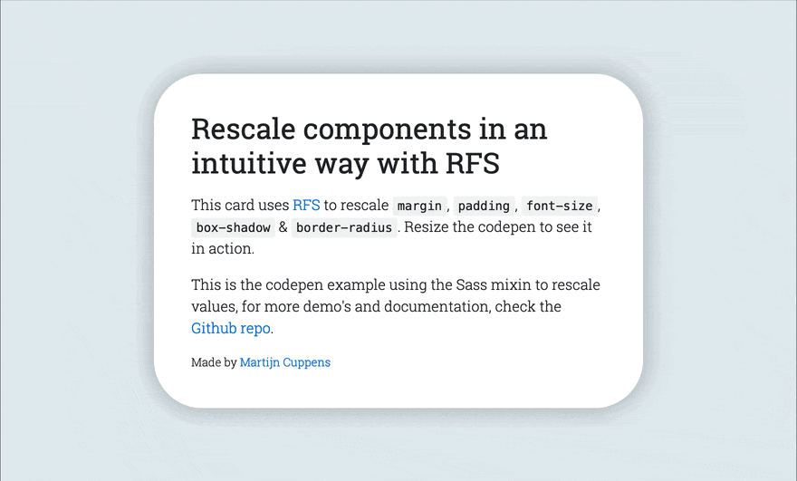 +The following example shows the effect of RFS on font sizes: + ## Installation @@ -47,32 +57,20 @@ RFS can be installed using a package manager (recommended): The source files can also be downloaded manually and used in a project. This method is not recommended because you lose the ability to easily and quickly manage and update RFS as a dependency. - ## Usage -In the following examples, this folder structure is assumed (you will probably just use one pre/postprocessor): +### Sass (<code>.scss</code> syntax) ```text project/ -├── postcss/ -│ └── main.css -├── less/ -│ └── main.less ├── node_modules/ │ └── rfs │ └── ... -├── sass/ -│ └── main.sass -├── scss/ -│ └── main.scss -└── stylus/ - └── main.styl +└── scss/ + └── main.scss ``` - -### Sass - -`.scss` syntax: +#### Input ```scss // scss/main.scss @@ -81,14 +79,89 @@ project/ .title { @include font-size(4rem); - // or - @include responsive-font-size(64px); - // or - @include rfs(64); + + // The font-size mixin is a shorthand which calls + // @include rfs(4rem, font-size); + + // Other shorthand mixins that are available are: + // @include padding(4rem); + // @include padding-top(4rem); + // @include padding-right(4rem); + // @include padding-bottom(4rem); + // @include padding-left(4rem); + // @include margin(4rem); + // @include margin-top(4rem); + // @include margin-right(4rem); + // @include margin-bottom(4rem); + // @include margin-left(4rem); + + // For properties which do not have a shorthand, the property can be passed: + // @include rfs(4rem, border-radius); + + // Whenever a value contains a space, it should be escaped with `#{}`: + // @include rfs(0 0 4rem red #{","} 0 0 5rem blue, box-shadow); + + // Custom properties (css variables): + // @include rfs(4rem, --border-radius); +} +``` + +If you're using Webpack, you can simplify the `@import` using the `~` prefix: + +```scss +@import "~rfs/scss"; +``` + +#### Generated css + +```css +.title { + font-size: calc(1.525rem + 3.3vw); +} + +@media (min-width: 1200px) { + .title { + font-size: 4rem; + } +} +``` + +#### !important usage + +##### Input + +```scss +.label { + @include font-size(2.5rem !important); +} +``` + +##### Output + +```css +.label { + font-size: calc(1.375rem + 1.5vw) !important; +} + +@media (min-width: 1200px) { + .label { + font-size: 2.5rem !important; + } } ``` -`.sass` syntax: +### Sass (<code>.sass</code> syntax) + +```text +project/ +├── node_modules/ +│ └── rfs +│ └── ... +└── sass/ + └── main.sass +``` + +#### Input ```sass // scss/main.scss @@ -97,30 +170,139 @@ project/ .title +font-size(4rem) - // or - +responsive-font-size(64px) - // or - +rfs(64) + + // The font-size mixin is a shorthand which calls + // +rfs(4rem, font-size) + + // Other shorthand mixins that are available are: + // +padding(4rem) + // +padding-top(4rem) + // +padding-right(4rem) + // +padding-bottom(4rem) + // +padding-left(4rem) + // +margin(4rem) + // +margin-top(4rem) + // +margin-right(4rem) + // +margin-bottom(4rem) + // +margin-left(4rem) + + // For properties which do not have a shorthand, the property can be passed: + // +rfs(4rem, border-radius) + + // Whenever a value contains a space, it should be escaped with `#{}`: + // +rfs(0 0 4rem red #{","} 0 0 5rem blue, box-shadow) + + // Custom properties (css variables): + // +rfs(4rem, --border-radius) +``` + +If you're using Webpack, you can simplify the `@import` using the `~` prefix: + +```sass +@import "~rfs/scss" +``` + +#### Generated css + +```css +.title { + font-size: calc(1.525rem + 3.3vw); +} + +@media (min-width: 1200px) { + .title { + font-size: 4rem; + } +} ``` +#### !important usage + +##### Input + +```sass +.label + +font-size(2.5rem !important) +``` + +#### output + +```css +.label { + font-size: calc(1.375rem + 1.5vw) !important; +} + +@media (min-width: 1200px) { + .label { + font-size: 2.5rem !important; + } +} +``` ### PostCSS +```text +project/ +├── postcss/ +│ └── main.css +└── node_modules/ + └── rfs + └── ... +``` + +Have a look at the [examples folder](https://github.com/twbs/rfs/tree/master/examples/postcss) to find examples of how your PostCSS setup can be configured. + ```postcss // postcss/main.css .title { - responsive-font-size: 4rem; - // or - rfs: 64; -} + font-size: rfs(4rem); + + // Or use it with any other property, eg + // padding: rfs(4rem); + + // It's also possible to pass multiple values + // padding: rfs(3rem 4rem); + + // or even + // box-shadow: rfs(0 3px 4rem red); -// Handle postcss afterwards (see examples folder for PostCSS example) + // or even comma seperated values + // box-shadow: rfs(0 3px 4rem red, 3px 0 4rem blue); + + // To combine it with !important, use + // box-shadow: rfs(0 3px 4rem red) !important; + + // Custom properties (css variables): + // --border-radius: rfs(4rem); +} ``` +#### Generated css + +```css +.title { + font-size: calc(1.525rem + 3.3vw); +} + +@media (min-width: 1200px) { + .title { + font-size: 4rem; + } +} +``` ### Less +```text +project/ +├── less/ +│ └── main.less +└── node_modules/ + └── rfs + └── ... +``` + ```less // less/main.less @@ -128,68 +310,175 @@ project/ .title { .font-size(4rem); - // or - .responsive-font-size(64px); - // or - .rfs(64); + + // The font-size mixin is a shorthand which calls + // .rfs(4rem, font-size); + + // Other shorthand mixins that are available are: + // .padding(4rem); + // .padding-top(4rem); + // .padding-right(4rem); + // 'padding-bottom(4rem); + // .padding-left(4rem); + // .margin(4rem); + // .margin-top(4rem); + // .margin-right(4rem); + // .margin-bottom(4rem); + // .margin-left(4rem); + + // For properties which do not have a shorthand, the property can be passed: + // .rfs(4rem, border-radius); + + // Whenever a value contains a space, it should be escaped with a tilde: + // .rfs(0 0 4rem red ~"," 0 0 5rem blue, box-shadow) + + // Custom properties (css variables): + // .rfs(4rem, --border-radius) +} +``` + +If you're using Webpack, you can simplify the `@import` using the `~` prefix: + +```less +@import "~rfs/less" +``` + +#### Generated css + +```css +.title { + font-size: calc(1.525rem + 3.3vw); +} + +@media (min-width: 1200px) { + .title { + font-size: 4rem; + } +} +``` + +#### !important usage + +Less still has [a bug](https://github.com/less/less.js/issues/2917) for [native `!important` support](http://lesscss.org/features/#mixins-feature-the-important-keyword), and `!important` can not be accepted as a parameter, so you 'll need to pass `important` as a flag: + +##### Input + +```less +.label { + .font-size(2.5rem important); } ``` +#### output + +```css +.label { + font-size: calc(1.375rem + 1.5vw) !important; +} + +@media (min-width: 1200px) { + .label { + font-size: 2.5rem !important; + } +} +``` ### Stylus +```text +project/ +├── node_modules/ +│ └── rfs +│ └── ... +└── stylus/ + └── main.styl +``` + ```stylus // stylus/main.styl @import "../node_modules/rfs/stylus"; .title - responsive-font-size(64px) - // or - rfs(64) + rfs-font-size(64px) + + // The font-size mixin is a shorthand which calls + // rfs(4rem, font-size) + + // Other shorthand mixins that are available are: + // rfs-padding(4rem) + // rfs-padding-top(4rem) + // rfs-padding-right(4rem) + // rfs-padding-bottom(4rem) + // rfs-padding-left(4rem) + // rfs-margin(4rem) + // rfs-margin-top(4rem) + // rfs-margin-right(4rem) + // rfs-margin-bottom(4rem) + // rfs-margin-left(4rem) + + // For properties which do not have a shorthand, the property can be passed: + // rfs(4rem, border-radius) + + // Whenever a value contains a space, it should be escaped with a backslash: + // rfs(0 0 4rem red \, 0 0 5rem blue, box-shadow) + + // Custom properties (css variables): + // rfs(4rem, --border-radius) ``` Note the `font-size` mixin can not be used to set the font size. That is because a `font-size()` mixin would override the `font-size` property. See [129#issuecomment-477926416](https://github.com/twbs/rfs/pull/129#issuecomment-477926416) for more info. -### Generated css +If you're using Webpack, you can simplify the `@import` using the `~` prefix: + +```stylus +@import "~rfs/stylus" +``` + +#### Generated css ```css .title { - font-size: 4rem; + font-size: calc(1.525rem + 3.3vw); } -@media (max-width: 1200px) { +@media (min-width: 1200px) { .title { - font-size: calc(1.525rem + 3.3vw); + font-size: 4rem; } } ``` -If you're using Webpack, you can simplify the `@import` using the `~` prefix: +#### !important usage -```scss -@import "~rfs/scss"; -``` - -```sass -@import "~rfs/sass" -``` +##### Input ```less -@import "~rfs/less"; +.label + rfs-font-size(2.5rem important) ``` -```stylus -@import "~rfs/stylus" +#### output + +```css +.label { + font-size: calc(1.375rem + 1.5vw) !important; +} + +@media (min-width: 1200px) { + .label { + font-size: 2.5rem !important; + } +} ``` ## Visualisation -If you wonder how the font sizes are rescaled, wonder no more and stare at this graph which might clarify things a bit: +If you wonder how the values are rescaled, wonder no more and stare at this graph which might clarify things a bit:  -Each color represents another font size being rescaled. For example: +Each color represents another value being rescaled. For example: ```scss .title { @@ -199,45 +488,40 @@ Each color represents another font size being rescaled. For example: This is the green line. A font size of `40px` stays `40px` in viewports with a size larger than `1200px`. Below `1200px`, the font size is rescaled and at viewport of `360px`, the font size is about `27px`. Note that every font size is generated in a combination of `rem` and `vw` units, but they are mapped to `px` in the graph to make it easier to understand. - ## Configuration -RFS works out of the box without any configuration tweaks, but if you feel the urge to go loco and fine tune the way font sizes are rescaled, you can: - +RFS works out of the box without any configuration tweaks, but if you feel the urge to go loco and fine tune the way values are rescaled, you can: -### Base font size <sub><sup>(unit in `px` or `rem`)</sup></sub> +### Base value <sub><sup>(unit in `px` or `rem`)</sup></sub> -- SCSS, Sass & Stylus: `$rfs-base-font-size` -- Less: `@rfs-base-font-size` -- PostCSS: `baseFontSize` +- SCSS, Sass & Stylus: `$rfs-base-value` +- Less: `@rfs-base-value` +- PostCSS: `baseValue` -The option will prevent the font size from becoming too small on smaller screens. If the font size which is passed to RFS is smaller than this base font size, no fluid font rescaling will take place. +The option will prevent the value from becoming too small on smaller screens. If the font size which is passed to RFS is smaller than this value, no fluid rescaling will take place. *Default value: `1.25rem`* +### Unit <sub><sup>(`px` or `rem`)</sup></sub> -### Font size unit <sub><sup>(`px` or `rem`)</sup></sub> - -- SCSS, Sass & Stylus: `$rfs-font-size-unit` -- Less: `@rfs-font-size-unit` -- PostCSS: `fontSizeUnit` +- SCSS, Sass & Stylus: `$rfs-unit` +- Less: `@rfs-unit` +- PostCSS: `unit` -The output font size will be rendered in this unit. Setting it in `px` will disable the ability for users to change the the font size in their browser. +The output value will be rendered in this unit. Keep in mind configuring this value to `px` will disable the ability for users to change the the font size in their browser. *Default value: `rem`* - ### Breakpoint <sub><sup>(in `px`, `em` or `rem`)</sup></sub> - SCSS, Sass & Stylus: `$rfs-breakpoint` - Less: `@rfs-breakpoint` - PostCSS: `breakpoint` -Above this breakpoint, the font size will be equal to the font size you passed to RFS; below the breakpoint, the font size will dynamically scale. +Above this breakpoint, the value will be equal to the value you passed to RFS; below the breakpoint, the value will dynamically scale. *Default value: `1200px`* - ### Breakpoint unit <sub><sup>(`px`, `em` or `rem`)</sup></sub> - SCSS, Sass & Stylus: `$rfs-breakpoint-unit` @@ -248,18 +532,16 @@ The width of the max width in the media query will be rendered in this unit. *Default value: `px`* - ### Factor <sub><sup>(number)</sup></sub> - SCSS, Sass & Stylus: `$rfs-factor` - Less: `@rfs-factor` - PostCSS: `factor` -This value determines the strength of font size resizing. The higher the factor, the less difference there is between font sizes on small screens. The lower the factor, the less influence RFS has, which results in bigger font sizes for small screens. The factor must be greater than 1. +This value determines the strength of font size resizing. The higher the factor, the less difference there is between values on small screens. The lower the factor, the less influence RFS has, which results in bigger values for small screens. The factor must be greater than 1. *Default value: `10`* - ### Rem value <sub><sup>(number)</sup></sub> - SCSS, Sass & Stylus: `$rfs-rem-value` @@ -270,18 +552,16 @@ The value of `1rem` in `px`. The value of `1rem` is typically `16px` but if the *Default value: `16`* - ### Two dimensional <sub><sup>(boolean)</sup></sub> - SCSS, Sass & Stylus: `$rfs-two-dimensional` - Less: `@rfs-two-dimensional` - PostCSS: `twoDimensional` -Enabling the two dimensional media queries will determine the font size based on the smallest side of the screen with `vmin`. This prevents the font size from changing if the device toggles between portrait and landscape mode. +Enabling the two dimensional media queries will determine the value based on the smallest side of the screen with `vmin`. This prevents values from changing if the device toggles between portrait and landscape mode. *Default value: `false`* - ### Class <sub><sup>(boolean)</sup></sub> - SCSS, Sass & Stylus: `$rfs-class` @@ -293,73 +573,30 @@ RFS can be enabled or disabled with a class. There are 3 options: - `false` No extra classes are generated. - `disable` - When the the disable classes are generated you can add the `.disable-responsive-font-size` class to an element to disable responsive font sizes for the element and its child elements. + When the the disable classes are generated you can add the `.disable-rfs` class to an element to disable responsive value rescaling for the element and its child elements. - `enable` - RFS is disabled by default in this case. The `.enable-responsive-font-size` class can be added to an element to enable responsive font sizes for the element and its child elements. + RFS is disabled by default in this case. The `.enable-rfs` class can be added to an element to enable responsive value rescaling for the element and its child elements. *Default value: `false`* - ### Safari iframe resize bug fix <sub><sup>(boolean)</sup></sub> - SCSS, Sass & Stylus: `$rfs-safari-iframe-resize-bug-fix` - Less: `@rfs-safari-iframe-resize-bug-fix` - PostCSS: `safariIframeResizeBugFix` -Safari doesn't resize its font size in an iframe if the iframe is resized. To fix this `min-width: 0vw` can be added and that's what happens if this option is enabled. See [#14](https://github.com/twbs/rfs/issues/14). +Safari doesn't resize its values in an iframe if the iframe is resized. To fix this `min-width: 0vw` can be added and that's what happens if this option is enabled. See [#14](https://github.com/twbs/rfs/issues/14). *Default value: `false`* - -## !important usage - -By setting a second parameter to true, `!important` is added after the font-size value. (Example is in `scss`) - -```scss -.label { - @include responsive-font-size(2.5rem, true); -} -``` - -CSS: - -```css -.label { - font-size: 2.5rem !important; -} - -@media (max-width: 1200px) { - .label { - font-size: calc(1.375rem + 1.5vw) !important; - } -} -``` - - ## Best practices - Don't set RFS on the `html` element, because this influences the value of `rem` and could lead to unexpected results. -- Always set your line-heights relative (in `em` or unitless) to prevent interline issues. - +- Always set your line-heights relative (in `em` or unitless) to prevent interline issues with font sizes. ## Browser support -RFS is supported by all browsers that support [media queries](https://caniuse.com/#feat=css-mediaqueries) and [viewport units](https://caniuse.com/#feat=viewport-units). In browsers like IE8 or older, the font size will be set but the fluid rescaling will be disabled. A list of the most popular browsers that support RFS: -- Chrome -- Safari -- Opera -- Firefox -- Edge -- Samsung Internet -- UC Browsers -- IE >= 9 - - -## Demos - -- [Simple Codepen Demo](https://codepen.io/MartijnCuppens/pen/ZBjdMy) -- [RFS in Bootstrap demo](https://project-rfs.github.io/) - +RFS is supported by all browsers that support [media queries](https://caniuse.com/#feat=css-mediaqueries) and [viewport units](https://caniuse.com/#feat=viewport-units). ## Creator @@ -368,7 +605,6 @@ RFS is supported by all browsers that support [media queries](https://caniuse.co - <https://twitter.com/Martijn_Cuppens> - <https://github.com/MartijnCuppens> - ## Copyright and license Code released under [the MIT license](https://github.com/twbs/rfs/blob/master/LICENSE). |