1
2
3
4
5
6
7
8
9
10
11
12
13
14
15
16
17
18
19
20
21
22
23
24
25
26
27
28
29
30
31
32
33
34
35
36
37
38
39
40
41
42
43
44
45
46
47
48
49
50
51
52
53
54
55
56
57
58
59
60
61
62
63
64
65
66
67
68
69
70
71
72
73
74
75
76
77
78
79
80
81
82
83
84
85
86
87
88
89
90
91
92
93
94
95
96
97
98
99
100
101
102
103
104
105
106
107
108
109
110
111
112
113
114
115
116
117
118
119
120
121
122
123
124
125
126
127
128
129
130
131
132
133
134
135
136
137
138
139
140
141
142
143
144
145
146
147
148
149
150
151
152
153
154
155
156
157
158
159
160
161
162
163
164
165
166
167
168
169
170
171
172
173
174
175
176
177
178
179
180
181
182
183
184
185
186
187
188
189
190
191
192
193
194
195
196
197
198
199
200
201
202
203
204
205
206
207
208
209
210
211
212
213
214
215
216
217
218
219
220
221
222
223
224
225
226
227
228
229
230
231
232
233
234
235
236
237
238
239
240
241
242
243
244
245
246
247
248
249
250
251
252
253
254
255
256
257
258
259
260
261
262
263
264
265
266
267
268
269
270
271
272
273
274
275
276
277
278
279
280
281
282
283
284
285
286
287
288
289
290
291
292
293
294
295
296
297
298
299
300
301
302
303
304
305
306
307
308
309
310
311
312
313
314
315
316
317
318
319
320
321
322
323
324
325
326
327
328
329
330
331
332
333
334
335
336
337
338
339
340
341
342
343
344
345
346
347
348
349
350
351
352
353
354
355
356
357
358
359
360
361
362
363
364
365
366
367
368
369
|
<p align="center">
<img src="https://raw.githubusercontent.com/twbs/rfs/master/.github/rfs.svg?sanitize=true" alt="RFS logo" width="99" height="108.6">
</p>
<p align="center">
RFS (simply the abbreviation for Responsive Font Size) is a font size engine which <strong>automatically calculates the appropriate font size</strong> based on the dimensions of the browser viewport. It's available in one of your favourite preprocessors or postprocessor: <a href="https://sass-lang.com/">Sass</a>, <a href="http://lesscss.org/">Less</a>, <a href="http://stylus-lang.com/">Stylus</a> or <a href="https://postcss.org/">PostCSS</a>.
</p>
# RFS
[![npm][npm-image]][npm-url]
[![licence][licence-image]][license-url]
[![build][build-image]][build-url]
- [How does it work?](#how-does-it-work)
- [Installation](#installation)
- [Usage](#usage)
- [Visualisation](#visualisation)
- [Configuration](#configuration)
- [`!important` usage](#important-usage)
- [Demos](#demos)
- [Creator](#creator)
- [Copyright and license](#copyright-and-license)
## How does it work?
- Font sizes will **rescale for every screen or device**, this prevents long words from being chopped off the viewport on small devices
- RFS will prevent the font size from rescaling too small so readability can be assured
- **Super easy** to use, just use the `font-size` mixin (or `responsive-font-size` property for PostCSS) instead of the `font-size` property
- The font sizes of all text elements will always remain in relation with each other
## Installation
RFS can be installed using a package manager (recommended):
- npm: `npm install rfs`
- yarn: `yarn add rfs`
- bower (deprecated): `bower install rfs --save`
**Copy/paste (not recommended):**
The source files can also be downloaded manually and used in a project. This method is not recommended because you
lose the ability to easily and quickly manage and update RFS as a dependency.
## Usage
In the following examples, this folder structure is assumed (you will probably just use one pre/postprocessor):
```text
project/
├── postccss/
│ └── main.css
├── less/
│ └── main.less
├── node_modules/
│ └── rfs
│ └── ...
├── sass/
│ └── main.sass
├── scss/
│ └── main.scss
└── stylus/
└── main.styl
```
### Sass
`.scss` syntax:
```scss
// scss/main.scss
@import "../node_modules/rfs/scss";
.title {
@include font-size(4rem);
// or
@include responsive-font-size(64px);
// or
@include rfs(64);
}
```
`.sass` syntax:
```sass
// scss/main.scss
@import "../node_modules/rfs/sass"
.title
+font-size(4rem)
// or
+responsive-font-size(64px)
// or
+rfs(64)
```
### PostCSS
```postcss
// postcss/main.css
.title {
responsive-font-size: 4rem;
// or
rfs: 64;
}
// Handle postcss afterwards (see examples folder for PostCSS example)
```
### Less
```less
// less/main.less
@import "../node_modules/rfs/less";
.title {
.font-size(4rem);
// or
.responsive-font-size(64px);
// or
.rfs(64);
}
```
### Stylus
```stylus
// stylus/main.styl
@import "../node_modules/rfs/stylus";
.title
font-size(4rem)
// or
responsive-font-size(64px)
// or
rfs(64)
```
### Generated css
```css
.title {
font-size: 4rem;
}
@media (max-width: 1200px) {
.title {
font-size: calc(1.525rem + 3.3vw);
}
}
```
If you're using Webpack, you can simplify the `@import` using the `~` prefix:
```scss
@import "~rfs/scss";
```
```sass
@import "~rfs/sass"
```
```less
@import "~rfs/less";
```
```stylus
@import "~rfs/stylus"
```
## Visualisation
If you wonder how the font sizes are rescaled, wonder no more and stare at this graph which might clarify things a bit:

Each color represents another font size being rescaled. For example:
```scss
.title {
@include font-size(40px);
}
```
This is the green line. A font size of `40px` stays `40px` in viewports with a size larger than `1200px`. Below `1200px`, the font size is rescaled and at viewport of `360px`, the font size is about `27px`. Note that every font size is generated in a combination of `rem` and `vw` units, but they are mapped to `px` in the graph to make it easier to understand.
## Configuration
RFS works out of the box without any configuration tweaks, but if you feel the urge to go loco and fine tune the way font sizes are rescaled, you can:
### Base font size <sub><sup>(unit in `px` or `rem`)</sup></sub>
- SCSS, Sass & Stylus: `$rfs-base-font-size`
- Less: `@rfs-base-font-size`
- PostCSS: `baseFontSize`
The option will prevent the font size from becoming too small on smaller screens. If the font size which is passed to RFS is smaller than this base font size, no fluid font rescaling will take place.
*Default value: `1.25rem`*
### Font size unit <sub><sup>(`px` or `rem`)</sup></sub>
- SCSS, Sass & Stylus: `$rfs-font-size-unit`
- Less: `@rfs-font-size-unit`
- PostCSS: `fontSizeUnit`
The output font size will be rendered in this unit. Setting it in `px` will disable the ability for users to change the the font size in their browser.
*Default value: `rem`*
### Breakpoint <sub><sup>(in `px`, `em` or `rem`)</sup></sub>
- SCSS, Sass & Stylus: `$rfs-breakpoint`
- Less: `@rfs-breakpoint`
- PostCSS: `breakpoint`
Above this breakpoint, the font size will be equal to the font size you passed to RFS; below the breakpoint, the font size will dynamically scale.
*Default value: `1200px`*
### Breakpoint unit <sub><sup>(`px`, `em` or `rem`)</sup></sub>
- SCSS, Sass & Stylus: `$rfs-breakpoint-unit`
- Less: `@rfs-breakpoint-unit`
- PostCSS: `breakpointUnit`
The width of the max width in the media query will be rendered in this unit.
*Default value: `px`*
### Factor <sub><sup>(number)</sup></sub>
- SCSS, Sass & Stylus: `$rfs-factor`
- Less: `@rfs-factor`
- PostCSS: `factor`
This value determines the strength of font size resizing. The higher the factor, the less difference there is between font sizes on small screens. The lower the factor, the less influence RFS has, which results in bigger font sizes for small screens. The factor must me greater than 1.
*Default value: `10`*
### Rem value <sub><sup>(number)</sup></sub>
- SCSS, Sass & Stylus: `$rfs-rem-value`
- Less: `@rfs-rem-value`
- PostCSS: `remValue`
The value of `1rem` in `px`. The value of `1rem` is typically `16px` but if the font size is changed for `html` the value of `1rem` changes. This variable can be used to change the default value but be careful with it because changing it could lead to unexpected behaviour, for example if additional CSS is loaded which expects `1rem` to be `16px`.
*Default value: `16`*
### Two dimensional <sub><sup>(boolean)</sup></sub>
- SCSS, Sass & Stylus: `$rfs-two-dimensional`
- Less: `@rfs-two-dimensional`
- PostCSS: `twoDimensional`
Enabling the two dimensional media queries will determine the font size based on the smallest side of the screen with `vmin`. This prevents the font size from changing if the device toggles between portrait and landscape mode.
*Default value: `false`*
### Class <sub><sup>(boolean)</sup></sub>
- SCSS, Sass & Stylus: `$rfs-class`
- Less: `@rfs-class`
- PostCSS: `class`
RFS can be enabled or disabled with a class. There are 3 options:
- `false`
No extra classes are generated.
- `disable`
When the the disable classes are generated you can add the `.disable-responsive-font-size` class to an element to disable responsive font sizes for the element and its child elements.
- `enable`
RFS is disabled by default in this case. The `.enable-responsive-font-size` class can be added to an element to enable responsive font sizes for the element and its child elements.
*Default value: `false`*
### Safari iframe resize bug fix <sub><sup>(boolean)</sup></sub>
- SCSS, Sass & Stylus: `$rfs-safari-iframe-resize-bug-fix`
- Less: `@rfs-safari-iframe-resize-bug-fix`
- PostCSS: `safariIframeResizeBugFix`
Safari doesn't resize its font size in an iframe if the iframe is resized. To fix this `min-width: 0vw` can be added and that's what happens if this option is enabled. See [#14](https://github.com/twbs/rfs/issues/14).
*Default value: `false`*
## !important usage
By setting a second parameter to true, `!important` is added after the font-size value. (Example is in `scss`)
```scss
.label {
@include responsive-font-size(2.5rem, true);
}
```
CSS:
```css
.label {
font-size: 2.5rem !important;
}
@media (max-width: 1200px) {
.label {
font-size: calc(1.375rem + 1.5vw) !important;
}
}
```
## Best practices
- Don't set RFS on the `html` element, because this influences the value of `rem` and could lead to unexpected results.
- Always set your line-heights relative (in `em` or unitless) to prevent interline issues.
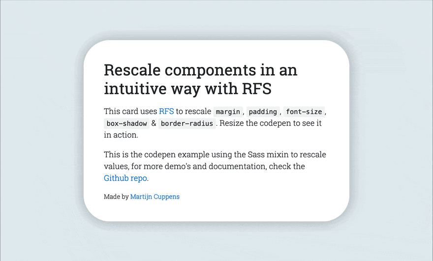
## Demos
- [Simple Codepen Demo](https://codepen.io/MartijnCuppens/pen/ZBjdMy)
- [RFS in Bootstrap demo](https://project-rfs.github.io/)
## Creator
**Martijn Cuppens**
- <https://twitter.com/Martijn_Cuppens>
- <https://github.com/MartijnCuppens>
## Copyright and license
Code released under [the MIT license](https://github.com/twbs/rfs/blob/master/LICENSE).
[npm-image]: https://img.shields.io/npm/v/rfs.svg
[npm-url]: https://npmjs.org/package/rfs
[licence-image]: https://img.shields.io/npm/l/rfs.svg
[license-url]: https://github.com/twbs/rfs/blob/master/LICENSE
[build-image]: https://img.shields.io/travis/twbs/rfs/master.svg
[build-url]: https://travis-ci.org/twbs/rfs
|
